Thursday 25 October 2012

Concept crit

I focussed mainly on brief 3, Typo 12 and brief 4, ISTD Circus for the crit.  These are the boards I have prepared:


I asked the following questions and received feedback I received was as follow:


It ws really useful to get feedback actually written on the design sheets, as it was clear what the feedback related to.


The crit itself was really useful as I realised from looking through other people's blogs that my research is very content/product heavy which is a good thing but i need to perhaps strike a balance with visual/contextual research for inspiration design direction.

Liam made a useful observation of having a structure dprogramme of events like at the Royal Armouries.

Basically the feedback about the typefaces has reinforced what I thought ie stay away from the cliches.  I am glad the 'overprint' was quite well received as I want to stick with this.  I am just goiing to experiment with brighter colours


Wednesday 24 October 2012

Content for the Circus programme/promotion

As this is a typographic submission we have to include at least 500 words to demonstrate our understanding of layout, grid and hierarchy.

Jorvik Viking centre have Guidebooks which are 52 pages long.
Main contents:

Introduction

As this is an educational experience there is a lot of history included specifically about Vikings
 
There are also details about archaeology and how the site was excavated. Then details about how Jorvik was actually created.

Visting Jorvik - what you get from the experience.
Details of each part of the village.
Details of the exhibitions

Further exploration - links, other exhibition

There are also lots of images.

I am collecting words for content from the Context research below:
Adjectives/Verbs

Exhilarating
Sensational
Outrageous
Ravishing
Revelation
Daring
Celebrate
Juggling
Astounding
Spectacle
Spectacular
Extravaganza
Explore
Dazzle
Pure magic
Harlequin
Stripes
Explosion of delight

Content
Our Collection
Circus skills
Circus Acts
Circus tales
Circus parade/ travelling circus
The Circus comes to town
A galaxy of stars
Join the circus
Big top
Ladies & Gentleman, Boys & Girls
Sawdust
Animal rights
Freak shows
Ring master red coat
Roll up, roll up
Jump on the band wagon
Contemporary circus


High wire
Tight rope
Acrobats
Unicycle
Trapeze
Clowns
Elephants
Horses
Lions


Circus and Animal rights


My Circus experience would have to include imagery of animal acts through history however I would also like to include a section about Animal rights activisits and the promotion of Human only Circus acts.  This could be a transition between the old and the new.


Bears, elephants, tigers, and other animals do not voluntarily ride bicycles, stand on their heads, balance on balls, or jump through rings of fire. They don't perform these and other difficult tricks because they want to; they perform them because they're afraid of what will happen if they don't.
For animals in circuses, there is no such thing as "positive reinforcement"—only varying degrees of punishment and deprivation. To force them to perform these meaningless and physically uncomfortable tricks, trainers use whips, tight collars, muzzles, electric prods, bullhooks, and other painful tools of the trade.
In the Ringling Bros. circus, elephants are beaten, hit, poked, prodded, and jabbed with sharp hooks, sometimes until bloody. Ringling breaks the spirit of elephants when they're vulnerable babies who should still be with their mothers. Unsuspecting parents planning a family trip to the circus don't know about the violent training sessions with ropes, bullhooks, and electric shock prods that elephants endure. Heartbreaking photos reveal how Ringling Bros. circus trainers cruelly force baby elephants to learn tricks, and it's not through a reward system, as they claim.
But aren't wild animals in circuses banned? In March 2012 the government in Westminster announced a phase-in ban on wild animals in circuses in England with a lisencing scheme to be impilimented in the interim. However, the RSPCA have serious concerns as the government have yet to make a firm commitment to a deadline for a ban and the documents outlining the proposals are peppered with inconsistencies and contraditctions.
Im shocked and upset by the imagery as I was under the impression that most circuses did not use animals in their shows anymore.

http://www.telegraph.co.uk/news/uknews/law-and-order/8409600/Animal-rights-campaigners-expose-circus-cruelty.html

Tuesday 23 October 2012

Design development Circus logo

Two aspects of Circus entertainment throughout the ages is movement and colour, whetehr it is clowns, animals or acrobats.  
In an attempt to create 'movement' and also layering I experimented with he overprint attribute on Indesign


Another aspect of Circus life is diversity ( or oddity/freak shows if you go back to Victorians times).  I thought different typefaces from different eras may communicates this.
Bodoni, Bell Gothic and Courier


The dot above the 'i' gave me the idea of maybe subtly conveying the diamond pattern


I think the the typeface Clarendon is a good reference back to the 19th and 20th century.

Clarendon is an English slab-serif typeface that was created in England by Robert Besley for Thorowgood and Co. (or Thorowgood and Besley.), a type company formerly known as the Fann Street Foundry until approximately 1838. The typeface was published in 1845 after Besley, an employee of the foundry since 1826, was made a partner in the firm.[1] Due to its popularity, Besley registered the typeface under Britain's Ornamental Designs Act of 1842. The patent expired three years later, and other foundries were quick to copy it.[2] Clarendon is considered the first registered typeface, with the original matrices and punches remaining at Stephenson Blake and later residing at the Type Museum, London. They were marketed by Stephenson Blake as Consort, though some additional weights (a bold and italics) were cut in the 1950s. It was named after the Clarendon Press in Oxford. Designs for wood type were made from the mid 1840s on. The typeface was reworked by the Monotype foundry in 1935. It was also revised by Hermann Eidenbenz and Edouard Hoffmann in 1953, Freeman Craw as Craw Clarendon, an American version released by American Type Founders, in 1955,[3] and by Aldo Novarese as Egizio, complete with italics, in 1958, among others.


I tried adding a layer of ITC Franklin Gothic so the colours did not make too much black when layered.


Monday 22 October 2012

Brief 3 Revision

Once I had been to Typo London I revised the brief from rebranding the event to a Type and Layout based brief as follows:


Typo 2012 speaker research


Saturday 20th October 2012
3pm

It was a choice between Gerry Leondis This is the New Typography (and the Typefaces that Make it Work) or Kirsty Carter & Emma Thomas (A Practice For Everyday Life) Translating Personal to Public.  As I am exploring digital and also Typeface choice for digital I thought I may get more out of the Typography talk

Any how Gerry's talk was definitely relevant and has certainly whet my appetite to research typeface further.

Gerry Leondis
What Typo say:

Gerry Leonidas started working in 1986, spanning the transition that desktop computers brought to the design and print industry, while gathering qualifications of mostly peripheral relevance. In 1994 he found a home in the Department of Typography at the University of Reading, where he teaches typography and typeface design, and is heavily involved in knowledge transfer projects. Since 2001 he has been running the MA Typeface Design programme. He has been contributing to Greek typeface design projects for over fifteen years, working with most of the designers and foundries that matter. His perspective is one of placing typography in a wider context, and helping develop in designers an understanding of the basic principles, and an insight into the potential for originality. He is frequently invited to speak, teach, and review the work of others. Gerry will take the subject “social” down to the letter.


His talk slides are linked here:


Gerry will tell a story about typography, and typefaces. In this story, Typography is growing up, entering its sixth era. It is growing as a space shared by many disciplines, gathering readers who see – often for the first time – type, and spatial arrangement, and interaction as decisions that somebody made. In this story we see fundamental assumptions questioned, some thrown out with a “why on earth did we do it like this?”, and others kept with a forced admission that the old guys did get some things right after all. The best part of the story is the bit where typefaces become the looking glass through which all this comes together. There’s no baddie in this story.

Key learning points/quotes:


Typo London International Design conference 2012/The Brief

This was a diverse and mind opening couple of days.  I plan to document each of the speakers (I went to see at Typo 2012) including background, the actual talks and my opinions/what I took from each.  In addition I plan to reflect on the Conference as a whole and what my thoughts as a designer are going forward.
I then plan to research various reviews/publications/blogs to determine the best vehicle and context in which to deliver this material.  At this stage the target audience for my outcome is Graphic Design students and tutors at Leeds College of Art.  In the name of humanity (Matthew Butterick) I hope to pass on the inspiration and knowledge I have soaked up.

In addition I hope to get contributions from the other BAGD students who attended Matt, Dom, Yafet and Oli.

That is not the end of the research as from each speaker there were threads of inspiration for other briefs which I intend to follow up.

I have also set up a survey which is mainly aimed at my target audience which is tutors and students on the BAGD  although I added the link to my followers on Twitter:
To encourage people to actually do the survey i chose to ask just three questions.  I wanted to know if Typo was actually on people's radar and also if they were actually interested in finding out more.  I also think it is important to not to assume what format to present the review in.


Sunday 21 October 2012

Typo 2012 Sara De Bondt


Day One
Friday 20 October 2012
Logan hall
10AM  The Office Of Statistics

Sara De Bondt


What the Typo website said:


Sara De Bondt is a London-based, Belgian graphic designer and she is also publisher and editor of Occational Papers, a non-profit publisher of affordable books on the history of architecture, art, design, film and literature. Making knowledge available and affordable to all has become one of her central issues since starting Sara De Bondt studio in 2003. The studio’s approach is research and idea driven, with strong emphasis on visual clarity and typographic detailing.
It actively seeks out collaboration, both with its clients and colleagues, which has led to a wide range of projects from international clients such as Guggenheim, WIELS, Tate, ICA, V&A, Artissima, Interieur 2010, WIELS, Kunsthal Charlottenborg, MK Gallery, and many more.
Sara is a Visiting Professor at School of Arts, Ghent, and previously taught at Central Saint Martins and the Royal College of Art. She has given talks and workshops at conferences such as Integrated (Antwerp), Spark (Auckland), Otis (Los Angeles) and Kolla (Stockholm). In 2008 she founded Occasional Papers together with Antony Hudek, and since then has co-edited three books: The Master Builder: Talking with Ken Briggs, The Form of the Book Book (with Fraser Muggeridge) and Graphic Design: History in the Writing (1983–2011) (with Catherine de Smet).

The Talk is on Typo 12 so I am not going to transcribe the whole thing:

Key learning points:

Pitch Use the opportunity to do the research so even if you dont win, you learn something


A social way of producing things
Radical nature 2009 Barbican Art Gallery


Artists working in environment and nature

Socially responsability  - unnessary packaging, fake 'environmental'

There MOTO 100%recycled, 100% quality and no compromise

What is to be really green and How far can you practically push?

Apple's sustainable graphic design widget 

ecofont.eu - Ink jet printer fonts (uses less ink)

Their pitch to the barbican was a Manifesto.
Avoid heavy paper weights use lighter - use less material
Use staples instead of glue better for recycling
Avoid foil blocking

Used the material from the previous exhibition, Le Courbisier exhibition, to make the furniture for this exhibition,


The title wall was bits of white wall which was nailed and screwed together so could be re-sued

Reused Brabican archive and printed on the back of posters

The patterns inside the logo was so that printer used less ink

Not full page bleed pictures, smaller pictures

Riso printer - printed ond emand gallery guide - only printed 15,000 copies instead of the original order 30,000.


How Graphic Design itself  is social
Atissma - Art fair design

Considered two other big art fairs 0- frieze uses photographic images and Art unlimted Use typography and strong colours.  The premise was to avoid these two aethstics

All the marketing and print would use statistics - slight nightmare as every piece had to have a statistic attached to it

Everything became a collaboration 


The Office for Statistics was actually at the exhibition and generating data and  statistics live.


Gave out posters of the stats and discussed the Graphic design with people great to get feedback at this level.

The Community of Graphic Design

Set up a Small publishing house. Occasional papers,  in 2008 making books more affordable to students.

Book Fayre printed matter swap fair at the Barbican - no money allowed, a real social event.

Phraser Mudderidge - was a hard barterer.  Studio 'Please do not bend'

Get together with other professions

They don't just make books. also organise getting together - meet each other to talk about your work.  EG Richard Hollis collected writing gave a talk at Whitechapel for the book launch.

The Form of the Book Book


Tuesday 16 October 2012

New rationale and new Brief 2

Based on Fred's Briefing on Monday I have decided to replace Brief 2( Culture exhibition) with the App design brief.  It was the words any work to submit for assessment on Design Practice 3 cannot be resubmitted...I definately think i would do this brief more justice after Christmas as a potential FMP brief.

The App design brief will still challenge me and I will get more out of it not trying to squeeze it in amongst everything else

So revised Rationale as follows:


Schedule for Typo 2012

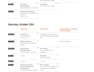
The Typo website allows you to plan your own schedule (the yellow bubbles indicate who i plan to see).  I have decided to take a dictaphone as there is no way I will remember all the words of wisdom.  I am also going to photograph all the event signage and maps etc.


Initial ideas for Circus logo


I would like to create the 'movement' and diversity that you experience at a Circus


Ideas for the name of the circus museum

The Greatest Show on earth

Circus Tales

The Greatest museum on Earth: Circus thrills and tales

Circus:  The Greatest Museum on earth

The Marvellous
Magic

Billy Smarts, Chipperfields,

The Roundhouse has ran two Circus Fest one in 2010 and one in 2012.  These are a celebration of contemporary Circus life.


This is some of the copy from the acts - could use some of this copy for content on the programmes etc:

Professor Vanessa's Wondershow
Professor Vanessa's Wondershow 
23 - 29 Apr / Main Space

Step back in time as our Main Space is transformed into a timeless village green for a magical immersive carnival experience that celebrates the golden era of circus.

Walk through a lost world of original vintage circus side-shows dating back to the 1930s-1950s and gasp at the hair-raising aerial performances, contemporary cabaret and illusion. Peek at the headless lady if you dare, marvel at the girl in the goldfish bowl, feel the power of Electra, the 27,000 volt girl and gaze with wonder at the spectacle that unfolds around you.

The show features an enviable line up of artists from the circus, cabaret and variety world including Miss Behave, Marawa The Amazing, Jon Marshall and his Sideshow Illusions and The Insect Circus.

The show was conceived by Professor Vanessa Toulmin, Director of the National Fairground Archive in Sheffield and one of the world’s leading experts on the history of the art form


Circus Space