Sunday 30 January 2011

Collection 100 - Design development toward progress crit

On my design context blog I have detailed the ongoing polls and discussions I have started on the Record Collectors Guild website.  As part of the research to establsih that there is a need for more information out there about Barney Bubbles I did a poll asking who had heard of Baney Bubbles?  As only ten people replied to the poll the test was by no means conclusive however only two people who voted had heard of him.  Just from general conversations around the studio I would estimate the majority of the Graphic design students at Leeds had not heard of Baney Bubbles.  So I concluded that

An audience of graphic designers and record collectors was out there (The cult following Barney has may also buy into my product)

Given the nature of my audience I felt the package had to be made from good quality stock and be clever in concept to appeal to both these groups. 

I chose to create a moving image as this has not yet been done (As documented there are various blogs and a book about his life).  I wanted the piece not only to inform but to intrigue people enough to investigate Barney further.


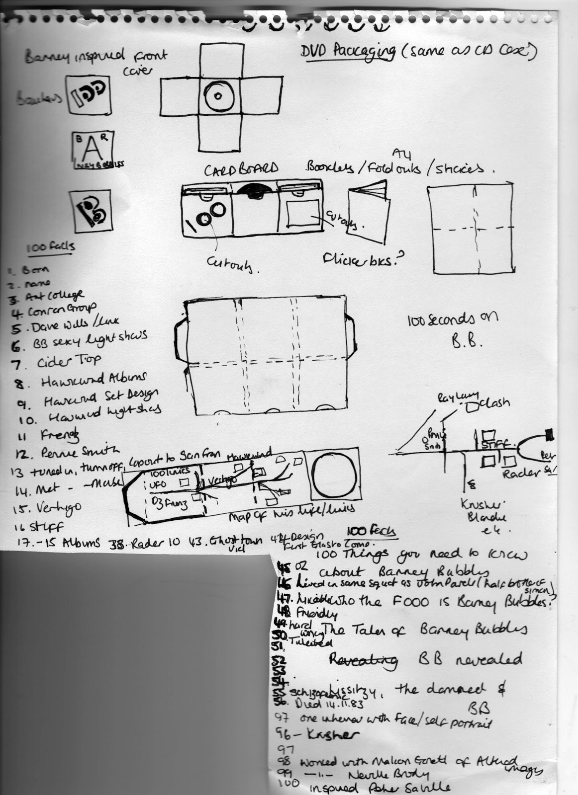
Now I had the idea and skills for the 'product' - the Moving Image; I decided to focus on product and package.  The package had been a strong influence from the start due to the nature of the Album Cover research.  I had also researched some CD packaging quite early on as linked here.

In preparation for the progress crit I storyboarded the moving image idea and also made 'a mock up' of the packaging idea as below:


The moving image naturally lent itself to music.  I chose Hawkwind's biggest hit 'Silver machine' as it was suitably psychedelic which suited the light show images.  I then chose two Elvis Costello hits 'Oliver's army' and Watching the detectives'  The second had a line with 'tear drops start' which fitted perfectly with the tear drop sequence.  The inspiration song at the end was easy New Order Blue Monday has a fantastic beat and is easily recognisable to people of my generation.  Also a lot of Graphic Design students will have studied Peter Saville and the New Order cover is iconic (One of out CTS lectures touched on it).  I was really keen to include the Ghost town movie which Barney had directed as it is so relevant for that period in the early eighties of Thatcher's Britain when unemployment was high.  Also for it represents a time when MTV had just come on the scene (1981) so video was really cutting edge at the time.

I actually work out out to copy the video, we had it on as an add on to a Specials CD.  Then it was simply a case of importing the MOV file into final cut and cutting and phasing as appropriate.(All new skills I have just learned!)    


I had now viewed so much of Barney's album work that I was sure that I wanted to reflect the influence of the design in the packaging somewhere.  I had been thinking of a title for the piece for a while when the idea of having the vinyl single image on the outside of the packaging came to me this led to the 'inside out' idea.  Coincidentally I read later in Reasons to be cheerful Barney actually contributed the idea for an Inside out single sleeve for Accidents will happen by Elvis Costello .  This seemed to be quite fitting.  I thought the Armed Forces cover for Elvis Costello was really strong.  So I copied the Jackson Pollock idea of splashed paint.  I was also drawn to the strong logo for the Blockheads he created so I copied this for 'Barney'


Friday 28 January 2011

Collection 100 - Design development linking Graphic Designers

These notes tie in with the Design research blog because as I was logging the research I was also trying to link the various creatives together.  Once I had realised the three way links infographic was not going to work well for a poster I then researched other methods of linking subjects.  This was when I remembered from a CTS lecture, looking at the Tube style map of The Great Bear, you can see the research for this here.

The idea was that I would reproduce 100 album links via an underground style map using Illustrator.  First I needed to 'map' this out.  I have scanned this work below.  As you can see this was getting quite 'busy' and at this stage I had only linked 42 albums.  I felt the map would have to be huge to see the album covers (A0 at least) which would have just been to expensive to print.  So I had a rethink.


The 'spine ' of the map seemed to be Barney Bubbles (Pencil on map).  I was becoming more and more intrigued by this little written about designer, so I decided to focus the research on him. After copious amounts of independent research  I found a book written by Paul Gorman called 'Reason to be cheerful' which joined all the dots.  What was emerging through the research that there were lots of blogs and almost a 'cult' following of this guy, yet still not a lot had been written about him.

After the first Moving image workshop with Mike I began to visualise the possibility of doing a Moving image about Barney Bubbles.  Even better after the second workshop when we used Final Cut express was that I could now work out how to link both Music and video to the images.

These are more notes linking various Graphic designers/artists/ photographers/album covers


Book Workshop


The Book workshop proved most enjoyable. It reminded me how much I enjoy practical hands on tasks!  Sarah demonstrated a few different methods of binding:
  1. The first and second image above is an example of Pamphlet Stitch
  2. Tools needed include a bone folder, needle and thread and Japanese screw punch
  3. Line up several pages, then crease down the middle
  4. With pages in a v shape create a three holes by pressing down the punch
  5. Sewing start o the outside, pull through hole, stitch to one side then across to the others.  Tie a knot.   
 The second image is an example of Japanese stab binding
  1. With this type the book cannot be open flat, good for flick books
  2. Draw a line 0.5 inch from the top
  3. mark 5 holes spaced evenly across this line
  4. Drill the holes (We used a hand drill)
  5. Then stitch up through the middle hole, leaving some thread dangling.
  6. Stitch around the edge of the book.

The images below are examples of a Concertina book.  
  1. We used 7 sheets of A4 paper.
  2. The paper is folded in half and then laid back to pack to create the concertina. 
  3. <
  4. >
  5. <
  6. >
  7. mark the facing pages where the glue will be applied   
  8. We used Buckram fabric for the cover
  9. To mark the cover. 
  10. Mark a small distance (1cm) from the edge.  
  11. Make the board the correct size(so there will be a small lip showing)


Thursday 27 January 2011

Moving image workshop and practice

This is a brief summary of the Moving image workshop as much for my reference as anything.


There are a number of considerations when dealing with moving image including:


1. Number of images working with
2. Digital video has industry standards called PAL (Phase, Altering, lines).  A UK standard video frame is '720x576' pixels.  The maximum frame rate is 25 frames per second.
3.  Preparation of the files because of PAL is very important.  


In Photoshop we need to re size our image pixel size to 720x576.  This is the correct proportion for RGB screen.  


Mike gave us a few tips on using actions in Photoshop which saves a lot of time.


To re size a large number of images :
1 open first image
2. Create a new action (under actions not paths)
3. Name action
4. Click record
Add action (This was to re size an image)


5. Image, image size, apply re size, OK
6. Save as, chose location, folder for re sized image
7. Close image , stop recording.


To automate this for a batch:


1. Images need to be in one folder
2. file, automate, batch, options: play : select action (re size)
                                                  source : choose folder
                                                  Destination: choose if not included as an action
3. OK


To use images for an image sequence the images need to be numbered sequentially. i.e. 001 to 100.


There are a number of ways to automate however the simplest is using Quicktime player 7


1. Select open image sequence on menu
2. Select first image
3 frame rate 25/12, can chose which frame rate we prefer.
4. Play
5 Once happy with speed.  Convert to a piece of video by:
a. Choose export from menu
b. 'Movie to Quicktime mvie' 
c Options setting Compressor = H.264
                          Frame rate- 25 frames per second
                          Quality - best
To post video on blog use Vimeo or YouTube.


Once logged on Vimeo you can upload videos to a blog.  Copy and paste the embed code into a new blog.


Quicktime player is not as flexible in terms of the number of images, using video clips and music. 
Video editing software, Final cut Express offers more flexibility however still need to prepare and number files sequentially. (If Illustrator files rastorize by opening in Photoshop)


1.  Ensure Final cut is setup correctly.

  1.      Choose setup
  2.      Easy setup
  3.      Video UK standard - PAL (NTSC = US standard)
  4.      'DV-PAL'      (Anamorphic is wide screen format)
  5.      Check Final Cut is saving files correctly.  System Settings, Scratch Disc Tab,Set
  6.      Set each four the same.
2.  File save project as


The screen looks like this:


The top left is called the 'Browser. use the 'list view' in the Browser.  
                   
3. Import file or folder


4. Each set of images can be saved as a different sequence.  By creating different sequences you can group them by duration of each frame for example.


5. Click and drag the file into the video track in the bottom window of the screen.


6. To play back drag the yellow triangle back to the beginning of the sequence.


7. Either press play in the right video screen or 'space bar'


8.To change the duration of the frame either CMD A to select all or click on frame


9.  Right click - chose duration on menu


10. This may gave you a red line at top of sequence bar.  This mean the file needs rendering - Menu, render both.


11. Shift Z allows you to see the whole sequence in one window.


12.  Can delete frames by clicking on frame then backspace


13. Can create any number of sequences. then can consolidate in one sequence by dragging each sequence from the browser window into the final sequence.


14 Can import Wav file and MOV files and edit in Final Cut.


15.  When the video is complete.  

  • File
  • Export
  • Use Quicktime conversion (For smaller files) or Quicktime movie to burn to a DVD
  • Save in user work.  Check video settings H.264, 25 frames and best quality.

To create text in Final cut


1.  Onthe first video viewer window. click 'A' button.  Various options including standard text at bottom, change fonts, font size etc in the Control tab.
2. Click and drag text down to sequence on video track 2.


To fade Video or sound in and out 


Use the pen tool to chose where the video or sound is to fade in or out.


Use TOAST to write files to a DVD disc.
Options


DVD Video
No Menu
Play all continuously
Best quality
Press red button. 
Record

Tuesday 25 January 2011

The anatomy of a book


Leaves- Individual sheet within a bound book


Pages - leaves have a front and back side each is a page


Page spreads - When bound together the right(recto) and left (verso) page are centred on a gutter where they are bound at the spine


Book design includes content,format, design and sequence.


Double page spread


Imposition
Precise arrangement of multiple pages on a large sheet of paper or press paper.  The layout and sequence is such that when the print is folded, bound and guillotined each element of the document is correctly positioned in the correct page sequence or page order.


Pagination


The process of dividing and numbering documents into pages. Pagination can include the attributes such as columns, margins, header and footers.  paginated documents can be viewed on the web or a hard copy.


Aspect ratio 
2:1 relationship between the width and height


Aspect relate to portrait (1:2) or landscape (2:1)


We then did an exercise of folding an A2 piece of paper seven time and then numbering each leaf from 1 to 32.  When the paper is folded out the result is the print layout for printing a book.


Recommended read


Book Design
Data flow
Mapping


Beauty of diagrams and Stats on BBC4


Saturday 22 January 2011

Workshop - Time management

We brainstormed in pairs how we think we waste time: examples included:

  • Facebook
  • Talking/chatting
  • watching TV/movies
  • X box
  • Procrastination
We discussed how we can improve our time management:
  • Set goals
  • Breakdown a task into individual manageable tasks
  • Schedule tasks
  • Recognise time needed to plan
  • Prioritise tasks A and B, so do all A's first
  • Leave fun things til last
  • Reward yourself
With better time management skills we will gain:
  • Learn more
  • Not feel guilty
  • more time 
  • improved the quality of work
We recorded how we felt we spent out time and then went on to spend a full week actually recording our time.  I represented my time using a Pie chart.  the only surprise was how much I sleep as I feel permanently tired!


Tuesday 18 January 2011

Type and grid

These notes are a summary of the seminar with Lorenzo and I have also used Ellen Lupton 'Thinking with type' and Basics Design Grids.

Make up of type


To understand the typeface technical terms used in software we can look back at the construction of the original letterpress blocks.


X height is the lower case 'x' height,  The anatomy of type is summarised by Ellen Lupton in the image below


Height

The point system is used to measure type. 
One point = 0.35 mm
12 points = 1 Pica

A Pica is the unit commonly used to measure column widths.

Typography can be measured in inches, millimetres or pixels and most software accommodates the users unit of choice; although pica's and points are standards.

A typeface is measured from the top of the capital letter to the bottom of the lowest descender, plus a small amount of buffer space.


Abbreviations

8 picas - 8p
8 points = p8 or 8 pts
8 picas, 4 points = 8p4
8 point Helvetica with 9 points of line spacing = 8/9 Helvetica

if no space or leading = 10 pt solid

The leading or line spacing was derived when the original letterpress fonts were spaced out using a piece of lead.


Width
A letter also has an horizontal measurement called its set width. Although you can change the set width of a typeface by altering the horizontal or vertical height it is recommended to chose the condensed, compressed, wide or extended version of the type you are looking for.

The x height, line weight and set width all contribute to the apparent size of different fonts.  So fonts with the same point size can appear different sizes.

Kerning
Is the space between any pair of letters

Tracking
Space between all the letters

The Grid

Anatomy of a page


Grid elements
Exist to position Type - needs to be readable
And image

Columns - number of columns and width

Baseline - a series of imaginary parallel lines used to guide the placement of text

Set solid - set text same leading as type sizes

Folios are sequential page numbers which guide the reader through a book.  Their placement on the page therefore is of great importance to the design.


In the workshop in groups we chose a newspaper and tried to work out what size grid the newspaper uses.  We had to measure and mark out the grid on the page. We had The Guardian which we discovered had a 20 column grid which enables the editor to layout very complex and varied layouts.It took us a while to work this one out! 

I later found an article on the Design Museum Website which explains the main grid is actually five columns however underlying this are 10 and 20 column grids.


Comparing layouts of Newspapers around the world

The work supporting this workshop is in the A2 folder.  This includes using a Pica ruler by measuring different typefaces, leading and establishing line spacing.  We also experimented with a magazine layout by redesigning several thumbnails before coming up with a final design.

This is the magazine layout I chose and also the final design I came up with.


A PICA ruler