Tuesday, 7 February 2012

The DVD package

For a while now I have been conscious I wanted to produce a cover which did the subject justice.... i wanted too ideally create something quite clever maybe die cut like the Physical Graffiti album .  I like the effect achieved on this Jazzanova In between CD cover:


This is actually really heavy cardboard and bound in a book - a bridge to far on the Sunday night before hand in!


I found these CD templates on line which include bleed print marks etc so this allowed me to concentrate on the design rather than the template. cd-dvd-artwork-templates


Pleased with the layout and colours (The Design module is making me think harder about this) .  I had to compromise on paper weight as printing at Rossingon Street was limited on stock.  I used a 230gsm matt stock which works but think a satin slightly heavier stock would have produced brighter colours and would have been stronger.  Could have been lined up and crafted better but overall think it does the digital work justice,


Monday, 6 February 2012

After effects development

Following the Final crit I worked on making the Mark farrow and Barney Bubbles  text more readable.


I also experimented with different background colours but in the end because of the vast number of colours in the Album covers stuck with white.  I also looked at adding a Vignette intially going with an elipse then settling on a rectangle. I think it suits the size of the screen better.


I also experimented further with the lights


File organisation in After Effects

I have screen shot some the AFter Effects project file.  It still looks really messy but I wanted o demonstrate I used a clear naming convention for all footage, layers and compositions.  In the end I had created over 35 compositions within one project all which were used to craete the 60 second sequence and the four ten second sequence. I am pleased to say I never lost a link or file!


Saturday, 4 February 2012

Almost there with 60 seconds

Still a few timing issues especially with the end sequence. Need to define a difference between 'ten graphic designers of album art' and 'who inspired who'   Also may add BBC4 white logo in top left as all their programmes have it.


Also changed the background to white with a black vignette rather than cream
 with orange one. Added shadow effects to the layers.

Last ten seconds development

I like the effect Vinyl Love achieved which was to move the original piece to the side of the screen and overwrite using the titles. One part of the feedback from the Crit from those that had not heard of the bands/music just thought it was a top ten about music.  They had not picked up on the Designers names I had added to the album covers.  Also I knew the current ending needed work as it was just a last minute idea to get the moving image finished for the Crit.


I started the Top Ten development process envisioning I could plot and animate the links and between the designers on a 'underground' style map.  After I had transferred the album covers into 3d I felt I was starting to achieve a 'walk' through the album covers.  By reversing this segment it reinforced this 'journey' through Ten Graphic designers and albums and also presented an opportunity to add the titles.


Feeling more confident with Cameras and nested compositions.  I nested the original sequence into a new composition then copied this again.  I tried to reverse the motion using time/time reverse layer but After effects would not then speed this layer up.


I looked into how to use the enable time remapping.  As we had looked at graphs with Mike I felt this was possible.  After some experiments I did work out how to reverse and speed 47 seconds and into ten seconds.


This is an image of the time remapping graph.


I found a free download of a record scratch on line on http://www.freesound.org.

I also added motion bur to this segment to enhance the 'speed'


In my crit group I had asked their advice about the titles and the verdict was that they needed to be kept really simple.


I had not realised until I had rendered this because I had the screen set up as two view I was not seeing the full screen when I set up the title sequence!


Friday, 3 February 2012

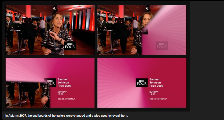
BBC4 end boards


Need to work out how to recreate this - Very quickly!  Sure there must be a tool in After Effects.

I started off by trying to create a segment in Illustrator and applying a gradient to the segment imagining it may be able to be animated however this was not working.

 After I found out this visual was called a wipe I then investigated 'wipe' in the After Effects menu and found them under Effects, transition.  There is a 'Radial wipe'.  This created the wipe however it looked quite flat so I started experimenting with other effects such CC light rays,CC Spot light, CC light sweep and Radial Shadow until I created the effect I wanted.


However I still had not created all the 'rays' so I experimented with laying over the effect from a Photoshop image as follows:

This did not work as it was too static.
Then I had a brain wave by copying and placing the first effects layer at six degree angles until I had made 90 degrees almost created the effect I was after:

From research I found the BBC used Gill Sans and the length of the End Board was about 4 seconds.  I also found a copy of the BBC four logo.  
I added the text and Jpg and applied the same radial wipe effect to these


Thursday, 2 February 2012

Experiment with 3D

I experimented with the 'journey' instead of moving passed the covers I tried having them approach the camera.  I also tried a different background colour - I was able to re-use this composition later for one of the ten second sequences just speeded up and adjusted slightly.


I dropped this idea for the 60 seconds as there was not enough time between some of the album sequences to play out - I was able to re-use this composition later for one of the ten second sequences just speeded up and adjusted slightly.

Reworking the lights

I asked Lorraine for some advice about why my light was creating a shadow at the front and not at the back.  She explained how the lights work and where they need to be placed .  She recommended a second light which is placed opposite the other one at about 30% intensity of the other.  This is the drawing she did - it actually helped me understand cameras in a 'physical way as up to this point I had just been experimenting with different transform and light options , seeing the effect ons screen.


The original lights was placed as below:


The two lights and repositioning proved more effective.  I think given more time I could have worked on the positioning on each album cover.  I also enhanced the 3d effect by adding shadow effects to each album cover.


Wednesday, 1 February 2012

Final Crit

At this stage I had reworked my 60 second ident to include 3d layers and cameras but had not yet started the 10 second idents however I had planned to get to this stage so was quite pleased.


 On seeing the others work in the group I was disappointed that had not worked on storyboards off screen more but I had just ran out of time - The group was Kirsty F, Emily, James, Eddie, Sarah and Liam.


I am actually really enjoying the crits as it is great to see how people are progressing and also how diverse the approaches to this brief have been.  The approach of actually leaving your own questions was a definite improvement as it meant the crit was more directed.  Its sometimes easy to focus on what a person has not achieved yet rather than helping them improved what is actually there. 


I have actioned most of the areas for improvement such as 

  • improving readability of text on certain Graphic designers, 
  • considering the amount of white space (by adding a Vignette),
  • the black Sarah referred to is a supposed to represent the thunder and lightening on the PetShop Boys track.  I dont think they could hear the track properly in the studio.  
  • One pair did not pick up the Graphic designers names and one pair did... I think it depends on the audience.  the pair that did not pick up the names did not know the albums/music whereas the others did.  My audience will be Music lovers/deign/art lovers so I dont think this is a major issue other than making some more readable.

The actions to the crit are documented in the After effects development blog


Final crit - 60 second ident


I am reasonably pleased with the flow and pace of the camera.  I still need to do some work on 'angles' and shadows.  Also the title sequence at the end was thrown together really quickly and needs some work.  


With the ten second idents I intend to use two album covers doing four different genres to appeal to a range of generations.  
I need to add the BBC4 logo to the top of the 60 second and I plan to include the closing sweeping circle that BBC4 currently use to close the ident.