
I tried knitting together different materials/watercolour as below

It became clear when I spoke to Amber on Thursday morning I had somewhat gone off on a tangent with the traditional 'knit' idea however was starting to make progress by 'knitting' fonts together. The interpretation for the brief was 'knit' as in join together.
Initially I tried tracing the 'knitted' together fonts however the resultant 'font' appeared to be a chinese font (as below)!

So I progressed my knitting fonts idea in Photoshop. I tried making the fonts and the edge of the paper 'knit'. I also tried 'knitting' the letter within the K as below
 |
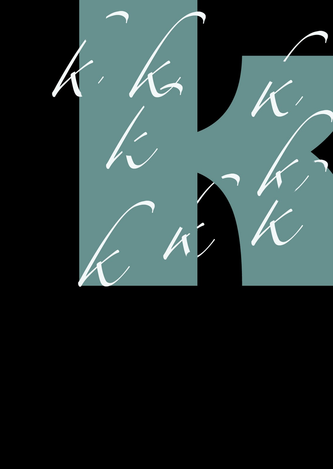
| The black background was effective so I used gain This time I tried knitting gigi, rivana and scriptana together |
In photoshop I experimented with knitting first of all the same font in different colours. I also played about with the opacity so the colours showed through each other. (Red +Blue = Purple). I like the zig zag effect on the k and also how the colours mix to form different 'k's within the main body.


From here I experimented overlaying different fonts. I tried to find fonts that would fit within a Garamond bold font. I used Zapfino, Scriptana, monotype corsiva, Times new roman,Gill sans and Consolas. I found the simpler san serif fonts the most effective for this exercise. I used the colour yellow+blue = green.
I thought an interesting twist on this idea would be to print each font on acetate.

No comments:
Post a Comment