The starting point for the What is good, the foundation for this brief started after reading through Good: An introduction to ethics in Graphic Design published by AVA. book. This book discusses ethical issues that challenge us as Graphic Designers and gives consideration to being a good or bad designer.
I used this to think about an issue that would be ethical to explore and as such started with Buying British is good. After researching this idea for a short time I realised it is quite hard to buy British these days so started looking at what we can source locally. This eventually led me to apples. I was quite shocked that we only eat 1 in 5 British grown apples and started thinking about perhaps providing some kind of education/info graphic.
The brand and identity direction came after I focussed on the Coop farm Sweetie apple. It was driven by the research about successful commercial apples which all have strong bands and promotion behind them. I believe the brand reflects 'superiority' but also with the blossom logo has connotations of nature.
The packaging will elevate the brand as it stands above the norm, particularly the paper bag which was said to look like a Donut bag making the apples more enticing. Apples are all about taste and appearance so the initial introduction to the market had to be a free apple to a large audience. The London half marathon is perfect both location, audience and timing wise.
On reflection, what may have seemed to some as quite ordinary has actually been a really interesting area to explore. One debate that I am still having with myself is whether it is better to buy and promote English heritage apples or English grown modern hybrids which are popular and sell. As such I am wondering how ethical my branding and promotion of a'modern' apple would be considered in some circles. I have exchanged a few interesting emails with the Founder and Editor of Orange Pippin. The website on the whole is all about our apple heritage however even he thought this was an interesting question. He was keen for me to stress the apple is 'English grown'.
Although I have not started with a cool, off the wall concept which could have made for an interesting journey, I think the apple has suited the brief well in terms of concept development for logo, brand and packaging and promotion. I have also had responses from the Coop Branding Manager and I intend to send a copy of the Presentation Boards for her feedback.

Design Practice
Showing posts with label OUGD201 Design for print. Show all posts
Showing posts with label OUGD201 Design for print. Show all posts
Monday, 21 November 2011

Sunday, 20 November 2011
Design for print manual for submission
I thought the last Print manual I had uploaded to Issuu was typo free, it wasn't! Also after the fantastic Generation Press visit I wanted to add a section about RAW files.
I also realised the 12 point font size I had chosen was too big following the last Typography workshop with Graham. Graham explained that generally books have a point size around 9 with an average of eleven words a line. The book now looks less cluttered as more white space was created by reducing point size to 11. I also looked at how the paragraphs were identified and ensured I was not using both indent and line space.
In addition I sent it for feedback o the Pre-press Supervisor at Spellman Walker, as when I visited he was a mine of information.
He very kindly gave me the following feedback which I have added to my top ten.
'Hey, that’s pretty good.
I would only make one suggestion for an addition – I’d add an extra line or two about cutter guides or at least make more of it because it’s a biggie.
We get lots of cutter supplied to us in 100% magenta when the job itself prints 4 col pro.
Designers should always spec the cutter keyline up as just “Cutter” and make it up out of 100% magenta BUT make it a spot colour.
That way it’s magenta, it’s easy to see but it’s also a spot colour called “cutter” - foolproof!
Most pre press studios will treat a cutter keyline as an overprint item (or ‘dieline’) so no need to worry about trap there.
Also, make sure your artwork bleeds out of the cutter area – if you make the artwork fit the cutter exactly and the finisher stamps the die slightly out of position (easily done) you will have white showing at the edge of your carefully trimmed job. Not good.'
I also realised the 12 point font size I had chosen was too big following the last Typography workshop with Graham. Graham explained that generally books have a point size around 9 with an average of eleven words a line. The book now looks less cluttered as more white space was created by reducing point size to 11. I also looked at how the paragraphs were identified and ensured I was not using both indent and line space.
In addition I sent it for feedback o the Pre-press Supervisor at Spellman Walker, as when I visited he was a mine of information.
He very kindly gave me the following feedback which I have added to my top ten.
'Hey, that’s pretty good.
I would only make one suggestion for an addition – I’d add an extra line or two about cutter guides or at least make more of it because it’s a biggie.
We get lots of cutter supplied to us in 100% magenta when the job itself prints 4 col pro.
Designers should always spec the cutter keyline up as just “Cutter” and make it up out of 100% magenta BUT make it a spot colour.
That way it’s magenta, it’s easy to see but it’s also a spot colour called “cutter” - foolproof!
Most pre press studios will treat a cutter keyline as an overprint item (or ‘dieline’) so no need to worry about trap there.
Also, make sure your artwork bleeds out of the cutter area – if you make the artwork fit the cutter exactly and the finisher stamps the die slightly out of position (easily done) you will have white showing at the edge of your carefully trimmed job. Not good.'
Thursday, 10 November 2011
Final Final final Issuu 10 steps to successful print
Proves the point about checking your work several times as I found several typos and other errors on a third read through!
Tuesday, 8 November 2011
Final final Issuu - What is design for print?
Spotted a few alignment problems caused by converting from facing pages to single pages for Issuu so uploaded another version:
Wednesday, 19 October 2011
Test Issuu publication
I have uploaded an incomplete Issuu PDF which is just as well as I have managed to get my double pages appearing as single pages! Will have to iron this out before final version.
Issuu top ten
Issuu top ten
Tuesday, 18 October 2011
Design for print workshop
Spot eight errors - 5 printing inks


The tree silhouette is not linked to the source file. Look at the Links Pallet and click on page number will show which image is missing. Can Relink the file in Links pallet if the file is available.


This font colour is Registration Black so exceeds 300% ink limit and may not dry and if off register would be unreadable (picks up 100% CMYK plus any spot colours (all printing plates) in the swatch)


Two Pantone colours too many in the Swatches pallet, the bottom two colours do not show on the Separation preview. Delete any unused Spot colours in your swatches pallet.

The resolution should be 300dpi not 72 dpi. To correct would need to rescan the image cant correct the original image in Photoshop.

Bird 1 has an effective PPI of 1897 so a large image was scaled down to 15% in Indesign. We can edit this in Photoshop by applying the 15.8 scale so we get the actual photoshop image in Indesign. The consequence of scaling down is that we are working with unnecessary large files. Also Indesign has to work harder to scale down which can lead to printing errors.

No bleed on the first page. (Press W to see all margins)

A RGB colour on this tiff. In Photoshop Use the Gamut warning can adjust the colour hue or just convert to CMYK

RGB blue has been used Would be converted to CMYK during the print process so his may lead to unexpected results. Double click on swatch and change to CMYK


Tuesday, 11 October 2011
Indesign - Colour workshop
The workshop was to prepare us to present documents suitable for Commercial Print. We discussed the different document presents of Book (for advanced book layout 100's of pages with chapters), Library (Collection of assets). Most document presets will be new document.
The page size is the FINISHED PRINTED TRIMMED SIZE
Guides - Number of columns
Margins can be 0 or personal choice to frame text
Bleed is usually 3mm


Short cuts 'W' is to see print preview
Apple shift > increases font size

Applying colour
- Create a frame or type ( Apple shift > increases font size)
Apple shift C Centre / R right/ L left
 Press X on keyboard can shift between fill & stroke
2 Additional buttons:
T - can apply colour to text
Formatting effects container
2. Add new swatches to Swatch pallet
New colour swatch - the grey square indicates they are Global colours- Allows you to make Global changes to your art work. And also the only way to make tints of a colour.
3. To create a tints swatch use mini menu set up tint swatch
Same method as working with Spot colours
New colour swatch - the grey square indicates they are Global colours- Allows you to make Global changes to your art work. And also the only way to make tints of a colour.
3. To create a tints swatch use mini menu set up tint swatch
Same method as working with Spot colours


Preparation of images for Indesign
In Photoshop
1. CMYK colour mode, grayscale, duotone montone
2. Resolution 300dpi
3. Create it printable size so when in Indesign don't need to change the size
4. File type format = .tiff or .psd * ( ot Jpg as compressed by lowering quality of image)
* Use .psd if working with Transparent areas
Place or prepare a frame in Indesign
If there are any Spot colours in the image they will automatically appear on the Swatch
In Illustrator
1. Colour mode CMYK
2. Artwork is scaleable
3. Format is .Ai
File, place
Check box - show import options default is Boundary Box. Tick transparent background


A vectored image can appear pixelated in indesign as Indesign links and makes low resolution to save space. the only purpose in Indesign is to provide an image for placement and order
Links pallet - keep all images for Indesign in one folder
If you edit the image in Illustrator it will update the image in indesign

Can edit Illusrator/Photohop/ .tiff images quickly by
1. ctl click edit original
or
2. Selection tool, alt double click will open up in illustrator file save.
Using a Grayscale .tiff file
Working with one colour print
Click on circles to select image within the frame
Choose the colour


Colour separations
Printers don't produce composite images
Printing colour separations defines
Print menu
Output
Click on colour
Choose separations
Each print would define the colour and where it falls on the image
It is possible to see the layout separation on the screen
Press window
output
Separations preview
Change new menu to separations to see each colour click on each one
If using this ensure any unused spot colours are deleted otherwise a blank separation plate could be printed out 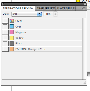

Two spot colours process is knocked out - prevents other colours being made
This is the default setting for process colours
Black ink will overprint
To control whether an ink knocks out or overprints
Need the separations switched on
Window
Output
Attributes
Overprint fill - applies to an object
Only see overprint is for Commercial print (Speak directly to printers)
Can apply too much ink to paper
The ink limit is set to 300% in Adobe
The separations pallet provides the 'Ink limits'
Gloss varnish
Define using a spot colour not used in art work
Let printer know this separation is the varnish
Can use for nets to use for cutting out
Select area where spot colour and using attributes select overprint fill.


Tuesday, 4 October 2011
Design for print - Photoshop colour workshop
New doc - resolution 300dpi
Colour mode: CMYK
Considering scale. If you need to scale up an image consider using a higher resolution ie is you scan a 35mm slide in use 1000dpi so can still get a reasonable print if you enlarge.


To convert RGB file to CMYK
Menu
Image
Mode
CMYK
Always edit in RGB and convert to CMYK at the end. Disadvantage of working in CMYK is that file sizes are larger
RGB are not based on % but a range from 0 - 255

If you use a RGB file can view Gamut warning

Then adjust image using adjustment - Hue & saturation or Brightness and Contrast
or
Convert file to CMYK to let Photoshop correct

Then adjust image using adjustment - Hue & saturation or Brightness and Contrast
or
Convert file to CMYK to let Photoshop correct

Can layer mask to isolate certain parts of the image then use replace colour. This provide more control

Increase the fuzziness to select more of the image. USe the eye dropper to select colour.


Another option (recommended) Photoshop makes the decisions
Menu
View
Proof colours
File appears (RGB/8/CMYK)
This option is where you are still working in RGB but the preview is the CMYK version

Creating colours in Photoshop
Menu
Window
Swatches
To make a specific pallet
Remove all existing colours
Delete swatches by holding pointer over Swatches pallet then press alt key.
To make a new swatch
Click on foreground colour
Choose colour
If get ! means not CMYK so click on square below for nearest printable colour
or manually move around until the ! disappears
Add the colour to swatch pallet
Add to swatches or just right click in your swatches pallet


Pick a Spot colour using colour picker
colour libraries
Choose appropriate book for stock or advise from printer
Type a number and will jump to correct colour
To fill can alt delete fill foreground
Always keep ref number

To retain Spot colours in photoshop
Make image grayscale (image, mode)
May need to adjust contrast
Convert to one colour prin job
Image mode
select Duotone
Can leave black or other colour (monotone)
Or use Spot colour click on black square to choose
The black ink is replaced with the process colour

The duotone curve allows you to change how to change how mapped to grayscale ratio
.PSD files support Montone images
If you place in Indesign automatically adds the spot colour to the Swatch Pallet
Can change spot colour and make Duotone or 3/4 colour


Can change the mapping can apply to different parts of the grayscale.

Second method of applying a spot colour
Base on a selection
Channels pallet - how info about colour is stored
RGB = 4 channels
Grayscale = 1 channel
CMYK - 4 channels
Channels can store information about Selections
Select part of the image
then save the selection in the channels
Ne spot colour
Select area
Channel pallets menu
Select new spot channel
Specify spot clour
Will overprint the black area
When the active channel is selected can use any of the painting tools to edit ie erase etc


Can create a spot channel without using a selection
Select gradient tool to create a tint change solid
Uses for print finishing
Gloss varnish overlay - use a spot colour
Select area wish to apply UV varnish to
Select spot colour
specify to printer which Pantone colour = varnish
Subscribe to:
Posts (Atom)