BA (Hons.) GRAPHIC DESIGN LEVEL 05
Module Code OUGD201
Module Title DESIGN PRODUCTION - PRINT
END OF MODULE SELF-EVALUATION
NAME Lisa Whitaker BLOG. ADDRESS http://l-whitaker1013.blogspot.com
1. What skills have you developed through this module and how effectively do you think you have applied them?
• Lateral thinking to develop concepts has strengthened outcomes. Initially I did not ‘get it’ however can see how to use this method in the future.
• Hand drawn development of ideas – develops visual thinking - Drawing skills become more refined. Applied reasonably effectively.
• Understanding correct file formats for Illustrator, Photoshop and Indesign for design for print.
• Illustrator skills to the point where I am choosing Illustrator to design over Photoshop.
• Use of nets, vectoring and crafting of packages.
• Designing boards for presentation, really pleased with how the boards came together and was also a useful way to draw everything together at the end of the brief
2. What approaches to/methods of design production have you developed and how have they informed your design development process?
• Understanding commercial print has opened up more options for substrates, special finishing and colour
• Selection of images for print – use of vector artwork over pixelated ones.
• The use of the college print facilities – acetate, transparent ink, bleeds (if A3 only way to get a bleed digitally is to print A2)
• The importance of building relationships with printers and providing the best formats and information.
• Thinking about a variety of substrates and also the weight and properties of these eg how they fold, how they would feel made up
• Start printing dummies of text layout straight away. The screen is deceptive and often point size can be much smaller and still be readable.
3. What strengths can you identify in your work and how have/will you capitalise on these?
• Extensive research and analysis has enabled me to focus on a ‘real’ product and problem
• Pushing concept development has led to a strong brand and identity.
• Improving attention to type and layout
• Project planning and tenacity has allowed me to develop this brief extensively
• Growing confidence in asking for help from experts eg Photographer/product shots
4. What weaknesses can you identify in your work and how will you address these in the future?
• Lack of attention to detail especially before print, often caused when rushing to meet a print deadline. I need to factor extra time into reviewing for typos and other errors in the design.
• Explore more innovative Graphic Design for print. I tended to focus on the research for the apple and not get inspiration from a wider selection of contemporary Graphic Design.
• Towards the end of the brief I tended to design the nets digitally rather than develop ideas on paper first. Having seen some of the others design development I would like to apply this more in the future.
5. Identify five things that you will do differently next time and what do you expect to gain from doing these?
• Explore print finishes practically such as embossing, spot varnish and foiling so I can use them in future work.
• After the last type workshop with Graham I would have liked more time to apply what we had learned about font size, space and layout to my designs.
• I managed to blog quite consistently for most of the brief however lost the blog thread in last couple of weeks so had to pick up at the end which proved a challenge. OI f blogging as going along the ‘story’ is still fresh and the communication is stronger.
• My research was more directed towards about the apple, I would have explored more cutting edge packaging and layout through the print task to make the design and layout stronger.
• With the Design for print I should have spent some time designing the layout away from Indesign. The design would look more developed.
6.How would you grade yourself on the following areas:
(please indicate using an ‘x’)
5= excellent, 4 = very good, 3 = good, 2 = average, 1 = poor
1 2 3 4 5
Attendance x
Punctuality x
Motivation x
Commitment x
Quantity of work produced x
Quality of work produced x
Contribution to the group x
The evaluation of your work is an important part of the assessment criteria and represents a percentage of the overall grade. It is essential that you give yourself enough time to complete your written evaluation fully and with appropriate depth and level of self-reflection. If you have any questions relating to the self evaluation process speak to a member of staff as soon as possible.

Design Practice
Showing posts with label OUGD201. Show all posts
Showing posts with label OUGD201. Show all posts
Tuesday, 22 November 2011

Monday, 21 November 2011
Attempting to obtain costings


One of the UV printers I have been researching Oriel also provide standard Litho printing so I thought this would be a good opportunity to obtain at least a rough estimate of the difference in costs between printing on paper based stock versus polypropylene. No surprise, as this was not a live print job they have not responded with an estimate.
I had always imagined the re-usable container would be UV printed on polypropylene. After my research I understand this will be more expensive than the standard routes available. I considered this acceptable as this was proposed to be a limited edition offer to launch the product.
Since these ideas I then came up with a combined card /acetate hexagon which would prove to be strong enough for the apples and also the apple bag is a success.
PDF art work files for Commercial Print
I have ensured I have specified the Pantone spot colours and also the die cut and fold lines with a spot colour. I have also included in the description details of stock, special finishing and the colours.
As a separate issue because the hexagon shape and the bag are both two stocks I spoke to Mike about how I specify this on a PDF. In reality I would discuss with the printer to find out how he would prefer to be sent the information. For the PDF submission I created two art boards, one for each stock so that the PDF has two pages which are clearly described in the PDF details.


As a separate issue because the hexagon shape and the bag are both two stocks I spoke to Mike about how I specify this on a PDF. In reality I would discuss with the printer to find out how he would prefer to be sent the information. For the PDF submission I created two art boards, one for each stock so that the PDF has two pages which are clearly described in the PDF details.


Context - the Brand and Packaging
I could sourced the context images online so they were quite low resolution. I had to find a way to make the context photos sit well with the 'live' photos I had taken of the packaging. I experimented with a few effects between illustrator, live trace and also adding symbols in Illustrator into Photoshop.

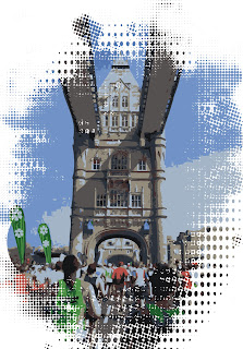




I could not find a realistic way to mockup a hexagonal banner or advertising poster on my contextual photos. The hexagonal shape would tie the promotion to the brand and packaging and also be distinctive. I image this would be made from a durable substrate such as digitally printed fabric or polypropylene which would be UV printed, also providing a link to transparency.

Other print based options are at the Food Festival. They can include the tent, table cloths, t-shirts (Screen printed), umbrellas. The people on the Sweetie apple stall would have a thorough knowledge of the apple and when giving the apple away know the apples benefits ie grown in Kent, supporting English orchards, not travelled 11,500 miles.

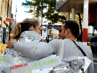
I have mocked up a blank foil blanket however the blanket could be UV or flexo printed with the Sweetie logo for further promotion with the runners once they complete the marathon. 'wear the blanket to the apple stall'

In store, I had imagined the strong stackable cartons which loose apples are delivered in would be hexagonal shaped, again to distinguish the sweetie from other brands. However I could not work out how to use 3d tools for a hexagon in Photoshop. As my final photographs were so professional I did not include this on the final presentation boards. These would be flexo printed on strong corrugated card.

At point of sale, an obvious addition to the promotion collection would be a shelf wobbler made out of acetate or polyproplene.


Finally just a note about the Marathon leaflet. Although I have submitted the larger hexagon as the final mockup I actually think the smaller size works better. The print quality is much better on the larger version however the smaller one is easier to handle and fold out. I think the larger leaflet is slightly cumbersome.
Attention to detail in Illustrator


The final mocked up bag has a mistake on it. I did not notice until after I had printed it but some how the green logo had been outlined in grey.... the logo really looses sharpness and looks less 'green'.
To do list
Just to demonstrate I am planning my time I have included my To do list from 16th November.


The one above is one I wrote on Sunday 21st November. I actually work more efficiently when working to a deadline and seem to manage my time better.


The one above is one I wrote on Sunday 21st November. I actually work more efficiently when working to a deadline and seem to manage my time better.
Sunday, 20 November 2011
Presentation Boards - What is good....
These have taken a long time to produce not least because I have incorporated a lot of new knowledge of Illustrator, Photoshop and Indesign. They were also challenging as these are the first A2 boards I have designed.
With more time I would have liked to get a photograph of the cotton bag 'in use', similar to the one below. I know exactly what it is but the boards don't demonstrate what it looks like and its context.

With more time I would have liked to get a photograph of the cotton bag 'in use', similar to the one below. I know exactly what it is but the boards don't demonstrate what it looks like and its context.
Product shots
A Photographer I know let me use his equipment, lighting and backdrop to take the product shots. I knew they would be tricky as they were white and had transparent areas. He advised me the trick is to have one light to light up the background and another focused on the product. Also a curved background avoids to many shadows.
Wednesday, 16 November 2011
Final crit


Stickie note feedback
Crit group chose the long hexagonal for holder box for limited edition.
"Not sure of appropriateness of bee - I understand its pollination but aesthetically it does not work.'
What I presented at Final Crit
I had managed to prepare two of my presentation sheets. The set was listed with the packaging mock ups as follows:
1. The packaging/products shot
2. The Brand and identity
3. Introductory promotion at London half marathon
4. Introductory promotion in store
5. Concept/logo/packaging development
I had a card mock up of the proposed flatter box, the single apple acetate, the four apple acetate, the paper bag all with real apples inside. The variety of apples I used were Braeburn and Jazz both related to the Sweetie apple so are similar in colour. I was pleased with the overall result and felt this represented the development of my work so far.
Evaluation of Crit
The feedback was very positive and generous. Emily who was not in my crit group even offered me her own feedback - She wanted an apple as they looked so tempting 'like little gems'.
'Donut bag is very good for apples- gives the guilty pleasure effect makes them more attractive - Sweet, delicious, forbidden'
( I did give her an apple by the way) Success!
Interesting idea about how the fold out hexagon can make a 3d flower shape.
I decided not to use Co-op branding on the packaging at this stage as I thought it wold make the design look to busy and also introduce too many colours to the Brand/identity. I will mock up a design at some point.
At the marathon you could have more links to he hexagon shape for banners etc. This is an area I have been developing however could not incorporate into the Photoshop pictures as they looked too flat.
Tuesday, 15 November 2011
The Packaging story so far....
To make the package more practically re-useable a handle may aid portability. When I made a couple of mockups with handles it became apparent that these design would probably not support the weight of several apples. Also I was keen to keep the hexagon shape and could not find any hexagon nets with handles. I have ran out of time to start designing my own net so decided to keep the hexagon shape and also explore other more environmentally friendly solutions as blogged on earlier post.


These are the finished nets I took to the Final Crit


The net below was an attempt to make the hexagon more sturdy by making the walls shorter and the lid larger. It reminds me of a Cake Shop box. I am going to experiment further with this in Acetate. Unfortunately this is the largest dimensions that will fit on an A2 sheet and only fits three apples in. To keep my printing costs down I am trying to keep to A2 or less. The lid fastening is quite cumbersome this size although these boxes would stack well on a shop shelf.


The original hexagon box made was to hold a single apple. This works from a display point of view and really sets the apple off however I would not propose using this. I cannot justify the re-usable element in the same way I can with the four apple holder. People would be unlikely to re-use for a single apple even if it offers protection. People buying single apples are generally often going to eat them straight away.


The paper bag ideas developed after the crit in an attempt to appear more environmentally friendly. The window was to 'display' the apples. The hexagon was a last minute inspiration which fitted with the continuing hexagon theme. I was initially designing this to add a handle on however once I had made the bag up it felt that the top should just be rolled down or stuck down with a sticker.
The bag is also strong as there is lots of space to add the Sweetie apple strap line and other benefits.


Brown paper bags/apples look 'right' as connotes recyclable but are not going to make the Sweetie Apple stand out on the shop shelves.
Continuing with the transparent theme I had always imagined the blossom label would be transparent only displaying the green 'w' however the label in practise just got lost. So for the crit I designed a label with a White background. Again this did not quite work in terms of visibility, so I am going to try with a green background

Subscribe to:
Posts (Atom)