Showing posts with label Brief 3 Typo 12. Show all posts

Friday, 7 December 2012

TYPO poster in College

I had a rather more successful result using 'Auto' and a tripod than I did the other day in the Photography Studios using the manual setting.


Saturday, 1 December 2012

Typo -Sample book

To challenge my type and layout skills I also designed a 'Sample' sized book which had exactly the same content as the book just smaller dimensions of 100mmx100mm dimensions.  I was also able to use a technique Mike had shown us in the Mac Tutorial.  I saved the document as a pdf them placed each page in another A4 size Indesign document complete with bleed and trim marks.


Content


Friday, 30 November 2012

Typo 2012 - Special finishing

Achieving the special finish.  As this was aimed at Designers I wanted to achive a special finish.  ie experiemented with Foiling in the Screen Print area.


The post effective was the black on black


I also printed the 1 square posters with Typo Twelve in large ltters across the 12 posters.  I tried foiling the Typo however the lines were too thin to really be effective.  Also the black on yellow was not as noticeable.


I then made the decision to somehow incorporate black into the posters.  The only way I could include laser printing (to achieve the foiling - will only work on Laser ink not inkjet) was to use it like a frame to attach the yellow squares to.  With more time I am sure I could have found a more appropriate solution ie digitally ink jet print then use a screen to foil the black.


Thursday, 29 November 2012

Typo 2012 Book development

For the first concept crit the format of the book was A5.  I was originally going to focus on ten quotes hence Typo Ten.  The book did not feel like it had much personality with just two typefaces and lots of white space so I decided to experiment with a different formats.  I also changed the main body text from Univers Condensed to Univers 55 Roman which did not look as 'Black' on the page and allowed the words to breath more.( This was also noted at the progress crit)

08/11/2012


Also looked at leading and paragraph spacing following feedback from the progress crit.
20/11/2012


The Square format worked better.  I printed some mockup off and decided to use a 21x21cm format rather than a 29.7x29.7.  The larger size did not sit as comfortably in your hands when reading it.

I chose the Univers/ Adobe Caslon combination initially following research into typeface combinations.
I followed the general rule of combining a sans serif and serif font.   These two websites in particular proved useful:


The Type Chat forums are also 'fonts' of knowledge about current thinking such as this one about Futura and Helvetica on Typophile:


The Typeface background

The Univers typeface family is one of the most prolific grotesque sans-serif typefaces of the century. Like Helvetica, Univers is based on 1898‘s Akzidenz-Grotesk. However, Univers is unique in that the design lacks superfluous features of any type, creating a design that is versatile and distinctive without being obtrusive. Adrian Frutiger began work on Univers in 1954, completing his design in 1957. The Univers type family has grown to 44 different weights and styles, some of which include Cyrillic characters.
A very important aspect of the Univers family is its modularity. Frutiger wanted to create a series of related designs that were absolutely harmonious with each other. This could only be accomplished by determining the complete family range as part of the design process or by building the family within a strict modular framework. Frutiger did both. Frutiger has continued to improve and expand the Univers family, working with Linotype designers to add new weights and enlarging the character set to include many languages such as Greek, Cyrillic and Arabic. The final iteration of the family, Univers Next – a complete upgrading of the design – was released in 2010.

Adobe Caslon
A long running serif font first designed by William Caslon in 1722 and used extensively throughout the British Empire in the early eighteen century. It was used widely in the early days of the American Colonies and was the font used for the U.S. Declaration of Independence, but fell out of favor soon after. It has been revived at various times since then, in particular during the British Arts and Crafts movement and again each time it went through a redesign for technological changes. It continues to be a standard in typography to this day 
Currently the Caslon font is in wide use and considered the standard for typesetters and printers. The rule of thumb continues to be, when in doubt use Caslon. Because a bold weight was not used commonly to create emphasis in type at the time of the development of the Caslon font, Caslon never designed a bold font weight. This peculiarity of the font style has stayed with it through several revivals. 
The close of the 19th Century has seen three major changes in the technology of typesetting that affected the Caslon font. Beginning with the introduction of hot type and then the development of phototypesetting in the 60s and 70s, we then saw the recent change to digital fonts that began in the mid 1980s. All of these technological changes have seen redesigns of the Caslon font, some with very little similarity to the original font outside of serif and the name. .

At this stage I was attempting to make the type and layout consistent across the whole book however I instinctively felt this was not working.  Andy suggested maybe using different typefaces for each quote. or changing the typeface sizes if they were only short quotes so they filled the space.
20/11/2012
In an attempt to maintain consistency across the book I also started using the Paragraph Styles feature in Indesign, something Mike had shown us in one of the Design for Print. I paid more attention to the real details such avoiding widows and orphans. I played around with kerning and tracking. 

 23/11/2012


As the development progressed I decided to be more experimental with some of the layout where appropriate ie the 'wierd' quote from Manchipp needed to distinguish itself from the others.

I also tried different designs for the Cover page


28/11/2012


As this was a book about a Typography event and I had now started using a range of typefaces I decided to add a Typeface index.  This extended my own understanding of the typefaces I was choosing.

I also added page numbers so the Contents and Index would have a reference.  This also added another Graphic point of interest.
30/11/2012
02/12/2012
Overall I think the book is a success in terms of developing my type and layout skills an also in terms of it makes an interesting read( positive feedback from the Final Crit) The format, colours and foiling all combine to give the book the high end feel I was trying to achieve. I like the saddlestitch binding however the crafting lets it down as I did not have time to use the book binding workshops. Also I did not really think about distribution. I was more focused on researching the Designers and studios and developing my type and layout skills.

Poster spread

I have been thinking how the Typo posters will run as a series and how they will appear on the wall.  I made the decision to make the series of quotes twelve rather than ten when i thought how the posters would work as a display ie 5x2 would not look make as much impact as 4x3.  I was trying to keep to the square format with both the book and the posters but the square poster did not have enough white space and looked cluttered so i made the decision to make them an A format.


This design just looks too busy but I wanted to try out the acetate and foiling.

The foiling worked best black on black.  I foiled the black on yellow 'TYPO' across the posters but the line was too think to be noticeable.  A suggestion at the progress crit was to maybe do the whole thing sold but this would distract people from actually reading the quotes.  The reason for choosing the foil was to provide a 'high end' finish and also attract attention.

Joe Gilmore talked of an idea he used with some photos where he cut the photos in half and displayed one half at the bottom of one spread and the other half at the top of the facing page.  I experimeted this with the Typo twelve across the series of twelve posters.


I think I will go with the A format and print on the mango paper stock and foil the Typo Twelve areas with black

Saturday, 17 November 2012

Typography and layout reference

One area I am developing is my Type and layout skills and to this end I have found some books to support this.

Spiekermann Erik & E.M. Ginger (2003) Stop Stealing Sheep & find out how type works, California, Adobe Press

This has been great as it has reinforced some of the lessons form Graham but also expands upon digital fonts.


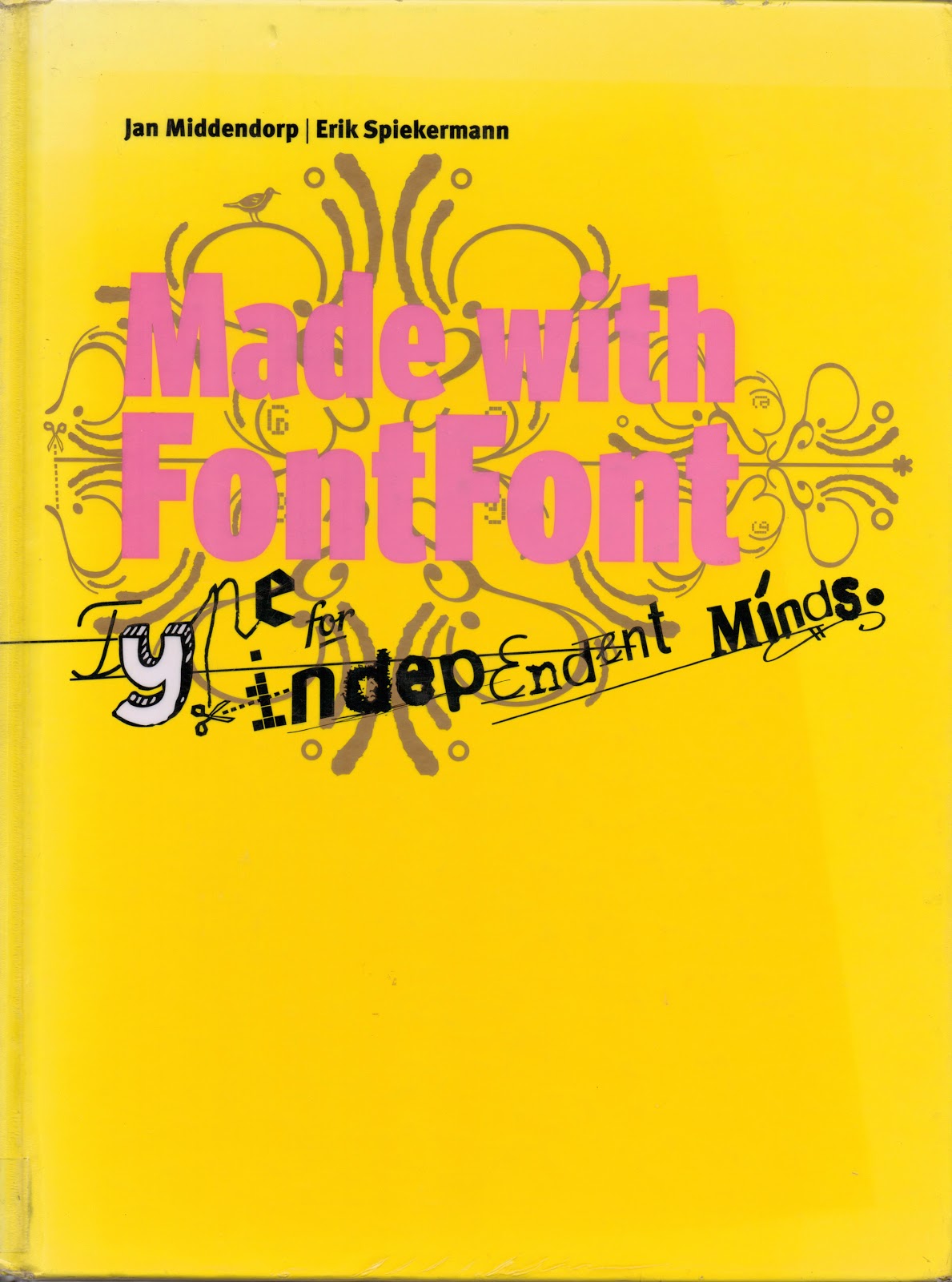
Spiekermann Erik, Middendorp Jan (2006),  Made with Font Font, Amsterdam BIS Publishers


Baines Phil & Haslam Andrew (2005) Type & Typography, New York Watson Guptil

I was chatting with Christian on the train, he who used to lecture at LCA on the Vis Comm Course.  He recommended this book when I said I wanted to investigate type more.  It really is such a good resource that after borrowing it from the library I now have bought it.  loads of terminology and rules which have improved my understanding.  Phil Baines works at St martins with Catherine Dixon and has associations with Erik Spiekermann (The Typo network!)


I could not resist the book which was promoted through Typo with free delivery and a special price for students.  It really is Typo gold.  
The book explains the decisions made and why they have made them. It also considers which typefaces work together.  http://explorationsintypography.com/

Bartolo de, C with Spiekermann E (2011),  Explorations in Typography/Mastering the Art of Fine Typesetting. San Anselmo, 101 Edition


Some key learning points:  Will keep adding to this...

Justified

Avoid justified type for narrow columns best sued for medium to wide.  Avoid rivers as they are a form of uneven colour.  Even colour is your highest typographic priority.  Always have auto-hyphenation (that was whats known as a happy accident!)  on when using justified to help maintain the typographic colour. A title is best set flush left.

Centred

Only use single column.  Turn auto-hypenation off.Only use for small quantities of text.  Sometimes need to set soft return manually to break text at commas and or perid.  Make last line shorter on each paragraph.