Showing posts with label OUGD103. Show all posts

Tuesday, 17 May 2011

Fun shop with John Watters


This workshop ran by John had a very different approach to anything else we have done this year.  John was trying to free up our thinking to really just come up with a BIG IDEA.  Once we had an idea then think how to make it BIGGER.  
Most group naturally started getting into the detail i.e. where the event was to take place, practicalities however John asked us to forget this.  He had also put us in large groups deliberately so we had to split work down to work effectively.  Our group ended up being quite small from eleven down to seven.

Monday, 9 May 2011

Indesign - Layout development


These are some of the layouts I have been experimenting with. 


I tried the Guitar image in colour however I think the colour  distracts away from the purpose of the article


The Black and white image is more subtle. I used tints of one colour with black and white as this was something Chris said he liked.

Wednesday, 4 May 2011

Indesign - Chris Lawson further research

Given Chris's enjoyment of music I thought I would write the article with a Music/Rock angle.  I asked Chris to give me his top five Albums, songs and bands.  This is the result (79 words):

Top 5 albums
1.       Muse – Absolution
2.       2 Arctic Monkeys – Whatever people say I am, that’s what I’m not.
3.       3. Pendulum – Hold your colour
4.       4. Arcade fire – the Suburbs
5.       5. Metallica – Master of puppets
Top 5 songs
1.       Muse- Born
2.       Metallica – One
3.       Queens of the Stone Age – No-one knows
4.       Kasabian – Club foot
5.       Arcade Fire – The suburbs
Top 5 bands
1.       Muse
2.       Artic monkeys
3.       Kings of Leon
4.       Kasabian
5.       Metallica


To add more substance beyond the inerview I have also been looking at Chris's blog.  This has helped me understand what design Chris likes and also given me some insight into how he feels reading his evaluations.   Chris is drawn to very simple intelligent design.  I am really impressed by the work he did on What is a line and the fact he used his initiative to book himself for a laser cutter induction.  In fact this has actually made me realise how we have all grown in confidence so much this last few months.

Monday, 7 March 2011

Indesign workshop brief

The randomiser put me with Chris Lawson which was good as he is one person I have only had a brief conversation with about his Collection 100 guitar brief.


A summary of the conversation we had:


From leeds, living in leeds in family home.
Did geography, Graphic Product, Computing and Gen St A levels.


Got on Graphic Design ND at LAC (last minute decision after a level results.)


Gave him direction


Likes music, self taught guitar since 14 years old.  His dad plays rhythm guitar ad was in a Punk band in the eighties.  Likes The Clash through his dad.  Wished Joe Strummer had not died so young as would have liked them to reform.


Influenced by Metallica however prefers Indie now, Arctic Monkies, Arcade Fire.  Went to Leedsfest last summer, Saw pendulum, GnR best was Blink 182.


Aspires to own a Guitar collection.


Works part time at Oulton Hall Hotel De Vere 4*.  Works in Events team which includes serving at weddings, setting up rooms for weddings, events and conferences.  Real eye for details, likes everything perfect however was worse when he was younger.


Likes Sans Serif fonts, Helvetica used Futura most recently  


Prefers subtle use of colour, favourite is B&W with spot colour.  Likes using tints of same colour.


Sunday, 6 March 2011

Opposites - development following crit

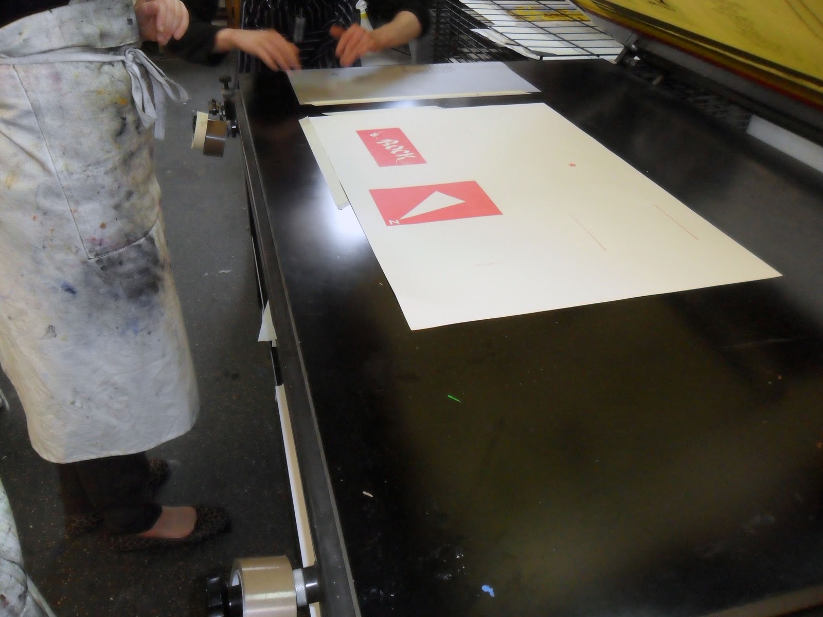
The screen printing on Thursday was really enjoyable and the outcome below was really aesthetically pleasing; however it some what interrupted the design process as I had spent Wednesday designing both for the brief and the screen print workshop.  As a result the outcome did not meet either perfectly. 

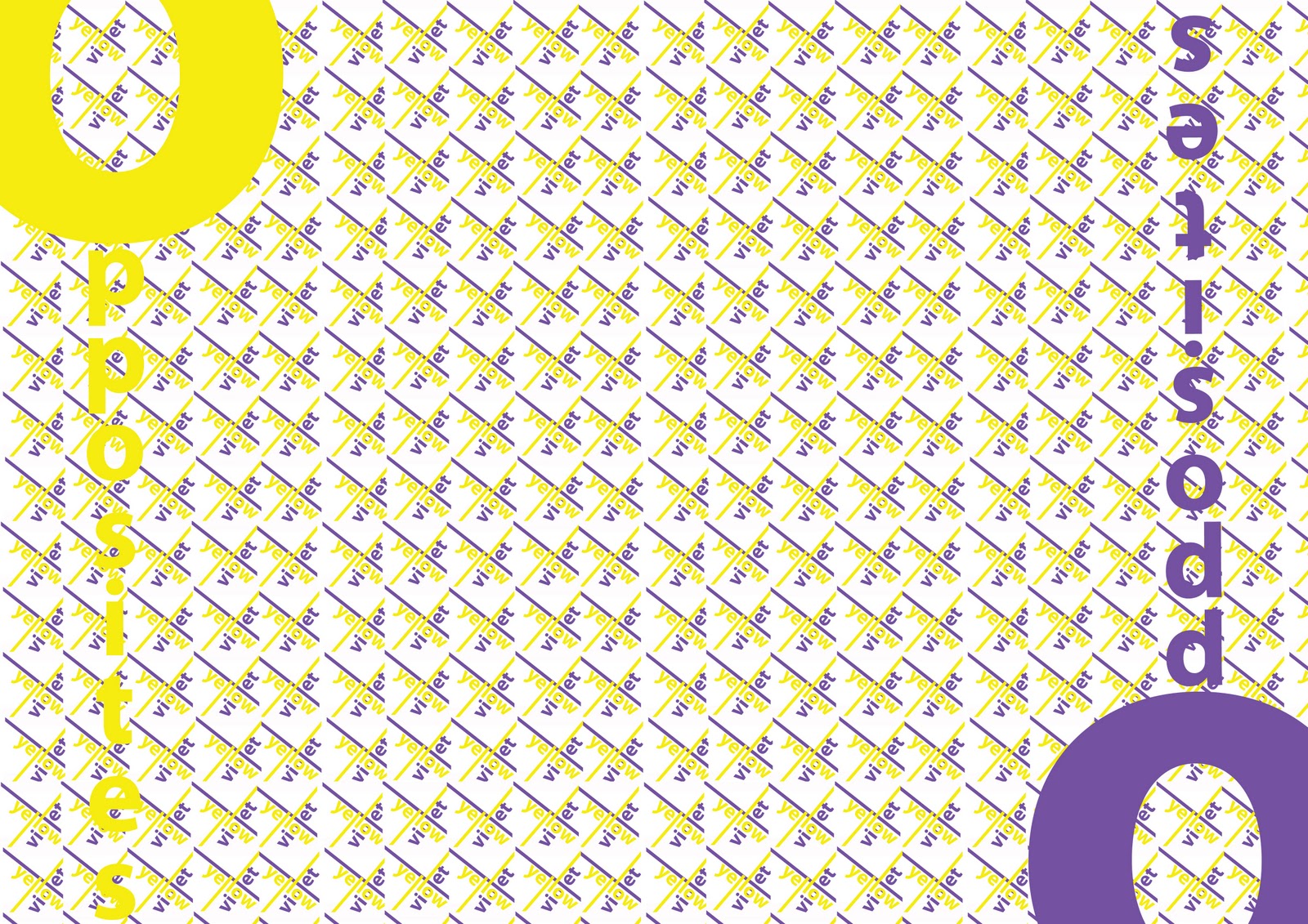
In the crit it was interesting to see how much work the group had achieved in a small space of time.  I stiil had not decided on the final outcome as although the orange and blue screen print worked visually it did not fully answer the brief,  I liked the magnet idea however did not feel my software skills were strong enough to execute it well enough.  The crit was really useful particularly one comment from Jo.  She said think about how the colours are opposite.  Also she said to try the pattern posters without the word opposite, so the poster was not telling the audience the whole message too obviously. 
I expressed the opinion that the brief ouctome had a duel purpose which had some what confused the target audience and also the form ie both a poster and for a book.  She said there was no reson the competition sumission could note a 'poster' 

I really puzzled over how to define how the complementary colours are different. As I was looking at the Colour picker it occured to me the Hex numbers define the colours.  So I played about with these.   The natural shape for the six complementary colours is an hexagon.  This fited neatly with the Hex number. 


 Also the CMYK % also define the colour, so following the Hex number idea I created the CMYK in the hexagon shape


 For the third poster I thought about doing something with RGB however it occurred to me that one key message to communicate about complementary's is that they mahe each other pop.  So using the hexagon shape once again I tried the word POP.  I then experimented with ways of trying to make the layout 'pop' which evolved into the final image.


Saturday, 5 March 2011

Screen print workshop - Rossington Street

Key points:

  • separate black and white positives needed for each colour
  • Can hand paint the emulsion onto the screen
  • The UV light travels through the paper, emulson and print
  • Postives need to be laser print noy inkjet or photcopies
  • try to avoid any overlap or tiling as will show when exposed
  • If do need to join use scotchtape not sellotape
  • Hobbs at St Pauls is a good printer
  • Usually print light to dark
  • use acrylic paint
We practised two colour seperation

Clean screen 
  1. Remove any tape from the screen
  2. Clean stencil off the screenwith diluted sulpuric acid
  3. Switch on extractor fan
  4. Start with inside out first
  5. Clean with sponge on both sides
  6. Then blast with the jet wash
  7. Important hat thoroughly clean
  8. Dry in rediator bins for  10 mins
Print image
  1. Change image from colour to grayscale
  2. Then increase level of black
  3. If tonal adjust the half tones
Coat screen with emulsion- Get help from staff
Dry for ten mins.

Expose image
  1. Place positives in centre of box
  2. Don't put screen on glass if emulsion is wet
  3. Screen
  4. Cover and clamp
  5. Different types of positives have different exposure times
Wash in wash out booth

  1. Inside first, Not full blast just wet with shower
  2.  Wash less if want a grainy print, more if solid
The colour
  1. Mix binder with acrylics to prolong drying time
  2. about 40% acrylic max (less if want more transluscent)
Mask of any yellow areas (exposed) around the edge of the screen


 Line up the master sheet under the screen on the table and mask off corner when in correct position

Fix frame into table and clamp down

Chose a suitable length squiggy


Hold Sqiggy at a 45 degree angle, dip in paint to lubricate.  Then puull back strongly over screen.  Push forward then lift up back over paint.   


 Lift frame then flood the screen by pushing squiggy back over screen.

Check the placement of the frame on the master sheet.  If Ok mask of with double layer of masking tape so You have an edge to line up later prints.

Then print as many copies as required

For secong colour do secongd colour on master sheet then place the first colour underneath to line up correctly


I used a separate screen as I needed to use orange and blue paint  When using two colours it is worth masking the second image off to avoid transfering colour.


Thouroughly wash and dry screen in between colour changes.


Tuesday, 1 March 2011

Opposites - Initial ideas


As I am working with colour the final result needs to be as accurate as possible in terms of the colours need to be true opposite.  I started to investigate software which would help me identify a colours true complimentary.  The first I found was a programme called Colour Picker.  You  literally enter any colour's Hex no. and it returns the complimentary colour - simple.

Joe Warburton also recommended an Adobe link called Kuler.