Spiekermann Erik & E.M. Ginger (2003) Stop Stealing Sheep & find out how type works, California, Adobe Press
This has been great as it has reinforced some of the lessons form Graham but also expands upon digital fonts.
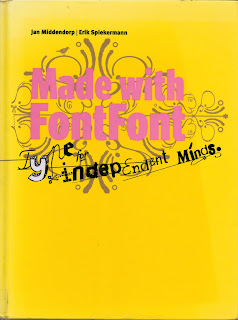
Spiekermann Erik, Middendorp Jan (2006), Made with Font Font, Amsterdam BIS Publishers
Baines Phil & Haslam Andrew (2005) Type & Typography, New York Watson Guptil
I was chatting with Christian on the train, he who used to lecture at LCA on the Vis Comm Course. He recommended this book when I said I wanted to investigate type more. It really is such a good resource that after borrowing it from the library I now have bought it. loads of terminology and rules which have improved my understanding. Phil Baines works at St martins with Catherine Dixon and has associations with Erik Spiekermann (The Typo network!)
I could not resist the book which was promoted through Typo with free delivery and a special price for students. It really is Typo gold.
The book explains the decisions made and why they have made them. It also considers which typefaces work together. http://explorationsintypography.com/
Bartolo de, C with Spiekermann E (2011), Explorations in Typography/Mastering the Art of Fine Typesetting. San Anselmo, 101 Edition
Some key learning points: Will keep adding to this...
Justified
Avoid justified type for narrow columns best sued for medium to wide. Avoid rivers as they are a form of uneven colour. Even colour is your highest typographic priority. Always have auto-hyphenation (that was whats known as a happy accident!) on when using justified to help maintain the typographic colour. A title is best set flush left.
Centred
Only use single column. Turn auto-hypenation off.Only use for small quantities of text. Sometimes need to set soft return manually to break text at commas and or perid. Make last line shorter on each paragraph.


No comments:
Post a Comment