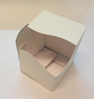
The direction for the packaging is to create something innovative which says premium, superior apples. I also would like the apples to be visible and protected.
I immediately liked the hexagon shape as I could image this would protect the apples really well if the correct tray or inserts were in the bottom.
I really like this 'cut ut' as by complete coincidence it is blossom shape. ALso it look like a 'gift' and has premium written all over it.
Really pleased with the look of this transparent acetate design however it was very fiddly to execute. I need to think of how to get cut marks on the net effectively or maybe laser cut?


No comments:
Post a Comment