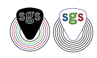
I felt it was important that the colours or levels meant something no matter how subtle that was. A big influence on David picking the guitar up was a band called Kiss who were best know for wearing full face makeup and each band member had is own character which in turn had its own colour.
The four colours were purple, red, blue and green.
Given the title of the brief Product and RANGE this feels ironically appropriate. Kiss are renowned for creating a massive range of merchandise anything from kiss dolls to clothing to lunch boxes to pin ball machines can be bought with the Kiss logo.
David wanted to try the cut out type again and also prefferred the rounder more open typeface of Calibri...just have reservations with Calibri as its is the default windows typeface and dont want this to look to generic. Although from a readability point of view it should be a familiar typeface for schools and children.
We both agreed the main logo would be black and white with four different levels/colours underlying this. I liked the idea of being able to rollover the logo on a web page and see different colours.(something we have just learned how to do)
Thinking about how the range of levels will look.


No comments:
Post a Comment