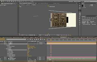
Following the Final crit I worked on making the Mark farrow and Barney Bubbles text more readable.
I also experimented with different background colours but in the end because of the vast number of colours in the Album covers stuck with white. I also looked at adding a Vignette intially going with an elipse then settling on a rectangle. I think it suits the size of the screen better.
I also experimented further with the lights


No comments:
Post a Comment