Wednesday, 29 February 2012

Progress Concept Crit and workshops


Kirsty missed this session so I fed back to her and we agreed on a list of actions

Action plan

Research bottle shapes, sizes
Snackpots/Catherdral city /Dairylea lunchables
Other dip type foods
wraps
Viral campaigns/motion graphics
Content, concept, media/distribution boards portrait
Survey - Salad cream - love it or hate it target 18 -26 year olds


Rewriting the YCN brief

We were tasked with looking at the YCN brief and basically making the brief less 'open'.


Monday, 27 February 2012

Workshop - YCN brief selection & analysis

The first half of the workshops was spent looking at the briefs we had each chosen and discussing the merits of each.


We are asked, as a pair, to pick two briefs that we liked and one that we didn't.  Kirsty and I brought along a  selection of different briefs that we personally liked/ disliked As we looked through our selection it was obvious Kirsty and I were targeting two in particular.


The two briefs we liked were the Heinz Salad cream and the Marks and Spencers brief and we didnt like was the SEGA brief. 


Five reasons we like:


Heinz Salad Cream


- we both could connect with the subject, as we both liked salad cream.
- There was an open outcome, which gaves us the opportunity to think digital or print based outcomes.
- The brief is light hearted and fun.
- The research will be interesting and fun to do, there are lots of Heinz campaigns we can look at.
- It will be a challenge because we will have to make the brand appeal to a younger target audience.


Marks and Spencers


-A broad target audience means we can choose who we target at.
- Comfort with considerations like colour.
- Interesting to research the M&S food.
- Design development for the final outcome will be interesting.
- Can relate to it and already start to come up with ideas.

Five reasons we dont like:


SEGA (The brief we dont like)


- The subject which is sport and football.
- Neither of us have a connection or relation to the subject matter.
- Never played a SEGA football manager game.
- Would be challenging to become interested in researching the topic and hard to get motivated.
- No relevance to how we want to develop as Graphic Designers.


The brief chosen was the Heinz Salad Cream brief
Five outcomes of the brief:


- Create a creative campaign.
- Get the young eating Heinz Salad Cream again.
- Associate salad cream with other 'popular' foods.
- Make the message upbeat/ fun.
- Generate excitement. 


Five Problems we thought we were being asked to solve:


- How to raise the profile of salad cream above other dressings and sauces.
- How to modernise a heritage brand.
- How to re- engage consumers to remind them of the great taste.
- How to embed new eating behaviours for salad cream.
- Make the campaign fun and upbeat, with a memorable message.


After choosing our brief we were asked to consider how open it actually was. We were given four categories to consider, of which we had to pick five points out of the brief for each one:


Content subject


- Heinz
- Salad cream
- Food values
- Taste
- Modernity (hip)


Media distribution


- Campaign
- New media/ interactive website
- Traditional media
- TV and radio commercials
- Posters


Audience context


- Fun
- 18-29 year old adults
- Sociable
- Food lovers
- Young


Product deliverables


- Name
- New product ideas
- Packaging
- 'A campaign'
- Digital media


In Freds words 'every brief offers you the opportunity to produce a rubbish outcome'


The nest step is to rewrite the brief and The Concept statement.
- What problems are we really being asked to solve?


Why has this brief been set?


Research
Understand the product/ interpret problems.

Wednesday, 22 February 2012

Painting exercise for Type and Layout


An interesting but flawed selection process

We selected our collaborative YCN brief partners today.  Unfortunately as Sadie had approached me to be her partner already I felt we had already chosen however as usual everything was put in the mix.  
We had to produce A3 posters  - one with five strengths and five weaknesses our things wanted our partner to bring.


Wednesday, 8 February 2012

End of module Evaluation of Design production: Digital


BA (Hons.) GRAPHIC DESIGN LEVEL 05
Module Code OUGD202
Module Title DESIGN PRODUCTION - DIGITAL


END OF MODULE SELF-EVALUATION


NAME Lisa Whitaker


1. What skills have you developed through this module and how effectively do you think you have applied them?


Although I had a brief introduction to After effects last year for Speaking from experience, I embraced the Mac tutorials and did not try to run before I could walk. I kept the five second silent movies quite simple, using techniques Mike had shown us. One of the most useful techniques was copying paths from Illustrator, particularly effective using the spiral path. Also the significance of different types of key frames ie linear and hold frames contributed. This gave me the confidence to explore more advanced techniques for the second brief such as 3d layers, cameras, lights and using different types of layers to create effects.
I feel comfortable in After Effects and have also learnt some new Illustrator and Photoshop techniques along the way. I have also learnt the importance of storyboarding, frames per second and planning. The key to success with After Effects is methodical file organisation. I feel I have fully utilised what I have learned in After Effects and the other workshops; part from falling down with the storyboarding for the Top ‘10’ and also not having time to analyse the final sequence Post production.


2. What approaches to/methods of design production have you developed and how have they informed your design development process?
The detailed timeline storyboards produced for the five second silent movie assisted with key framing the sequence. Using ‘markers’ in after effects especially along the sound track assisted with making the moving image running in time. Also once set up it avoided having to keep returning to the key frames in the sequence.
Importing Photoshop and layers was integral to the whole top ten sequence and deciding whether to retain layers sizes was also a key decision.
As mentioned above file organisation and also naming conventions were crucial to the success of the Design production. Keeping all the album sequences as separate composition enabled me to create several nested compositions and also take this and experiment with 3D layers and cameras.


3. What strengths can you identify in your work and how have/will you capitalise on these?
Pushing the boundaries of what we were taught in 2d to discover more advanced techniques in 3d meant I achieved a more polished finished result.
I managed to keep on track with the action plan i set on 25th January which meant I achieved the burnt disc for the SHow and Tell on the 7th.


4. What weaknesses can you identify in your work and how will you address these in the future?


I would have liked the Design concept to have a more experimental feel. I think because of the time constraints the outcome is quite literal ie the Album covers. I think if I had spent more time earlier in the research (ie at Xmas) developing the concept I would have been better prepared to run with it earlier in the process.
I focussed on getting across the context as opposed to the actual Graphics and titles which is apparent with the weak finish to the sixty seconds. Focus on this first before the full sequence.


5. Identify five things that you will do differently next time and what do you expect to gain from doing these?


1. Make more time to storyboard to achieve a more considered outcome


2.Be realistic about what can be achieved in the time, the outcome may be simpler but can meet all the requirements of the module


3. Resist the urge to learn too many new techniques and learn how to apply the simpler ones more effectively.


4. Try not to leave printing to two days before the deadline!At least i now have a back up (Rossington Street)if James is not in again.  It will give me time to refine the design/layout and print again to achieve a better finish.


5.


6.How would you grade yourself on the following areas:
(please indicate using an ‘x’)


5= excellent, 4 = very good, 3 = good, 2 = average, 1 = poor
1 2 3 4 5
Attendance x 5 
Punctuality x 5
Motivation x  4
Commitment x 4
Quantity of work produced 3
Quality of work produced  4
Contribution to the group  4


The evaluation of your work is an important part of the assessment criteria and represents a percentage of the overall grade. It is essential that you give yourself enough time to complete your written evaluation fully and with appropriate depth and level of self-reflection. If you have any questions relating to the self evaluation process speak to a member of staff as soon as possible.

Tuesday, 7 February 2012

Top ten final submission


The 10 second idents would be best ran as a set with the 'complete' run though of albums/designers  preceding the ones with just two albums/designers on.  With the Andy Warhol and Peter Corriston one this is a distinct period ie the 70's and would be aimed at people 40 plus in the first instance so would be shown before say a music culture programme about the sixties aor seventies.  The other with Pennie Smith and Futura 2000 is coming more 80's to 90's.  This has the 'cool' factor as Futura is an iconic figure now endorsing 'cool' labels but back in the day was a Graffiti artists and worked at Mo Wax with Ben Drury.  This would appeal to  a 25-50 year old audience.

Final evaluation of After effects and the outcome

Overall I have learned lots of new skills both through the Mac tutorials and Lorraine but also from online tutorials.  I feel comfortable with After Effects which was assisted by having a methodical filing system for all my files and assets.  This proved really important when I decided to start nesting compositions and reusing compositions to create 3 d layers and use cameras.

The final outcome could have been improved if I had storyboarded the whole sequence.  Although I was clear about the each individual album composition and even how they would link I had not thought through how it would end in terms of titles nor what typeface to use.  I think this is evident in the final piece.  

The ten second sequences were strengthened by the fact I had managed to reproduce a similar BBC4 End board.  This provides a clear brand identity for the Channel.

Initially I had considered producing quite a 'vectored' piece however when Fred briefed us early on he said to consider using found materials to add texture.  This was one reason I decided to scan actual album covers , where I had them.  I now think this adds to the general tone of voice rather than looking 'twee'.

Although I am disappointed I had neither the time nor the inclination to produce some storyboards I do think it would have been extremely time consuming to produce them for my piece.  The reason being once I had chosen the music it was important to ensure the moving image flowed and was timed to fit with the music.  To storyboard this I would have had to markout each beat frame by frame.  As it was I was able to mark the beats in after Effects and 'animate' accordingly.
  

The DVD package

For a while now I have been conscious I wanted to produce a cover which did the subject justice.... i wanted too ideally create something quite clever maybe die cut like the Physical Graffiti album .  I like the effect achieved on this Jazzanova In between CD cover:


This is actually really heavy cardboard and bound in a book - a bridge to far on the Sunday night before hand in!


I found these CD templates on line which include bleed print marks etc so this allowed me to concentrate on the design rather than the template. cd-dvd-artwork-templates


Pleased with the layout and colours (The Design module is making me think harder about this) .  I had to compromise on paper weight as printing at Rossingon Street was limited on stock.  I used a 230gsm matt stock which works but think a satin slightly heavier stock would have produced brighter colours and would have been stronger.  Could have been lined up and crafted better but overall think it does the digital work justice,


Monday, 6 February 2012

After effects development

Following the Final crit I worked on making the Mark farrow and Barney Bubbles  text more readable.


I also experimented with different background colours but in the end because of the vast number of colours in the Album covers stuck with white.  I also looked at adding a Vignette intially going with an elipse then settling on a rectangle. I think it suits the size of the screen better.


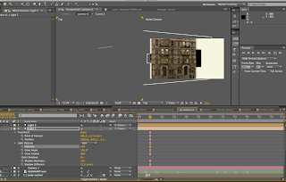
I also experimented further with the lights