My group was Charlotte, Max, Francesca, Sadie and Luke. Frankie joined us on the second day
the groups approach to the Top ten was quite diverse from Rocks, patterns, Film Noire, Hangover cures. There was some synergy between Max's (top guitarist) and mine as we were aiming at similar audience and TV channel (BBC4)
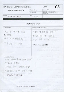
I felt unprepared for the first group crit as although I have extensive research I have not though through how to animate or what the tones of voice will be. When I actually discussed my boards and concept with the group I realised I had more of a direction than I had realised.
The learning points from the crit have been:
keep it simple
Need to think about the timing of idents
Think about legibilty
Think about linking from one designer to next - storyboard. Matbe use the symbols from the albums to link
When I discussed possibly using symbols from each album covers Luke shared this than Joe had shared with him:
This is a really simple vector based animation which works so well because of the synchronised sound effects and music.


No comments:
Post a Comment